AlphaMed is a medical supply company located in Jackson, TN. They needed to redesign a brochure, which would be placed in medical clinics to educate patients on the products they sell. Most medical marketing material I have seen has been less-than-interesting so, although I knew it would be a challenge, I couldn’t wait to get started. I also had to opportunity to utilize my copywriting skills on this one. Download the PDF
 AlphaMed’s tagline is “Begin Here.” As I thought about how the tagline might inform the brochure concept, I related my own need for medical supplies to beginning a journey. A few years ago, I was diagnosed with sleep apnea. My prescription was to sleep with a bi-pap machine, which is an item featured in this brochure. I remember how it affected my life. I could have looked at it as a hinderance to my freedom. This is a temptation anyone requiring medical supplies must face. However, I also knew that I had to look at the benefits. I slept better and felt better, as did my wife. I thought about my grandparents’ needs, the needs of my wife’s special needs students, the needs of my sister, father, and mother. I soon realized that this brochure could be more than a product promotion: it could be an encouragement.
The image of a peaceful path through a green forest came to mind. I found this photograph, featuring a nice violet blue to break up the green. The path leading off to the lower right was the perfect place to park the AlphaMed logo and tagline. The idea was that the right quarter would be the front and the brochure would be folded in half twice, creating 4 panels. I used the photo as a backdrop on which to place the message, “Every traveler needs a journey and every journey must begin…Begin your journey.”
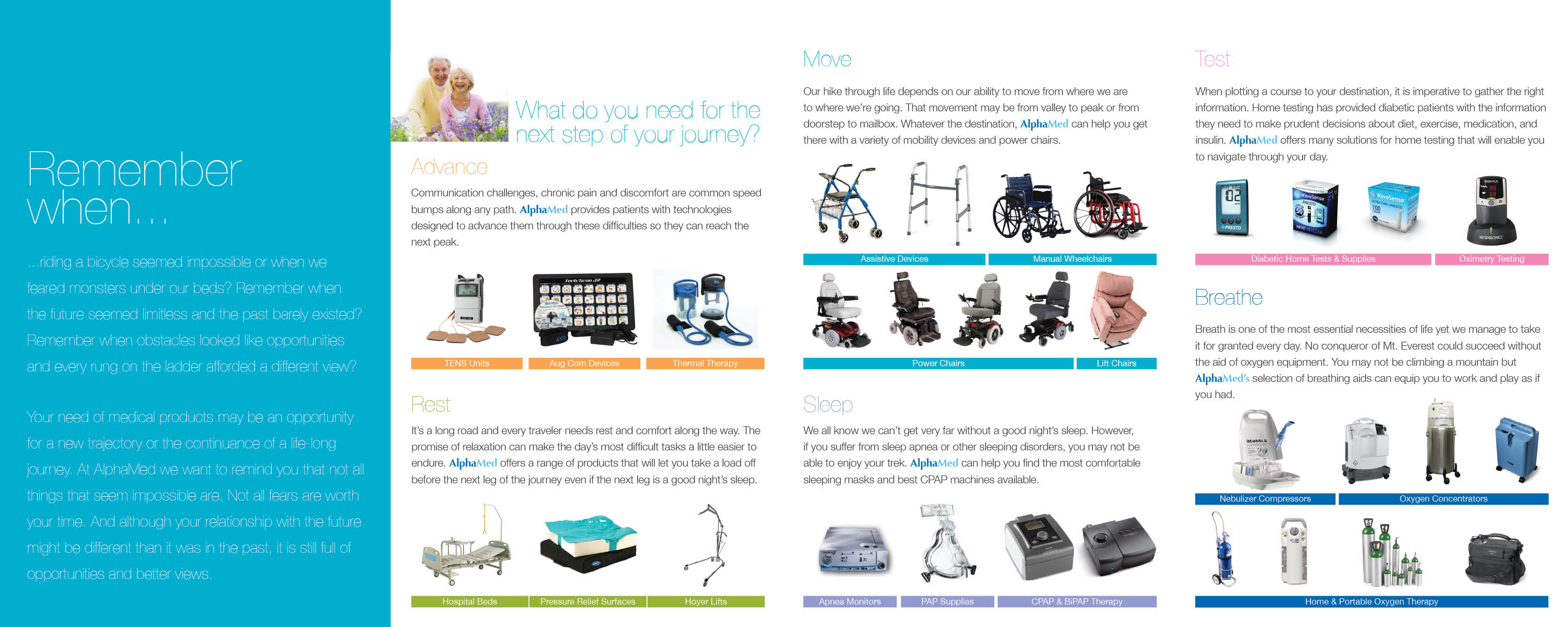
Although the inside was down-to-business, I was able to set the tone with some compelling copy on the left, inside panel. This helps to connect the front concept with the products highlighted. I organized all of the products under appropriate headings and assigned certain colors to each category. These colors have been repeated throughout many of the promotional materials we’ve created since. Each category features a brief paragraph linking the concept of the journey to the tools that make it possible.
This was a great project! I had a lot of freedom to determine format and concept. It continues to be one of those pieces I like to pull out every once in a while and flip through. AlphaMed continues to grow and I’m proud help that process along.