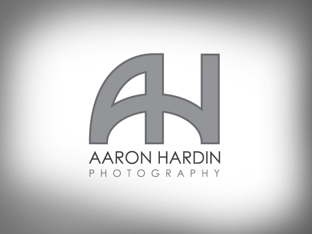
Although I love designing logos for friends, they always take 10x longer to complete. A third of the reason for this is that logos take a long time to design for anyone. Logos are deceptively simple. Another third of the reason is that I tend to be a perfectionist on logos because this is what a business builds its identity on. The last third of the reason for taking so long on friends’ logo projects is the worst reason of all: they’re my friends. Poor Aaron had to wait a long time for me to finish a logo for his photography business.

After exploring several approaches in a sketchbook, I found that it was a lot of fun to sign Aaron’s initials in a single stroke. I filled a couple of pages with attempts at this until I saw a very natural pattern developing. As I showed Aaron the possibilities, he instantly responded to those monogram-filled pages. I then began laying out a 6×6 grid and started placing as few points as possible to compose the simple stroke. Originally we had rounded the corners and experimented with various stroke weights. In the end, Aaron’s hard-edged, purist personality decided on a strict grayscale composition with hard corners and a san-sarif font for quick, easy legibility and simplicity.
Aaron Hardin is one of the most talented photographers I know. His work is astounding whether he’s shooting for the newspaper or your best friend’s wedding. Check out his work at aaronhardinphoto.com. Bes sure to comment on his awesome logo.
