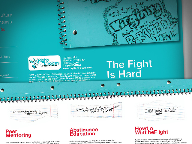
Right Choices of West Tennessee
Right Choices of West Tennessee is an non-profit organization which educates high school students on the virtues of abstinence. To…
Read more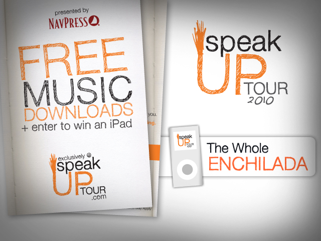
Speak Up Tour
A few months ago I was approached by the Starnes Group to design a campaign identity for the SpeakUp College…
Read more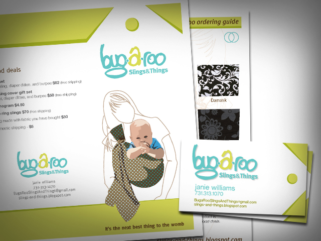
bug-a-roo: Identity Development
Taking on the task of developing an entire identity system for a company can be a daunting and difficult task….
Read more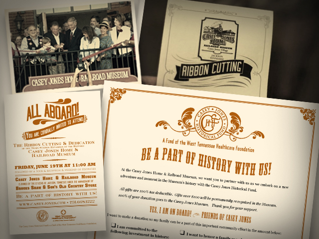
Casey Jones Village: Museum Ribbon Cutting
One of the first projects I did for Casey Jones Village was a promotional campaign for the grand opening of…
Read more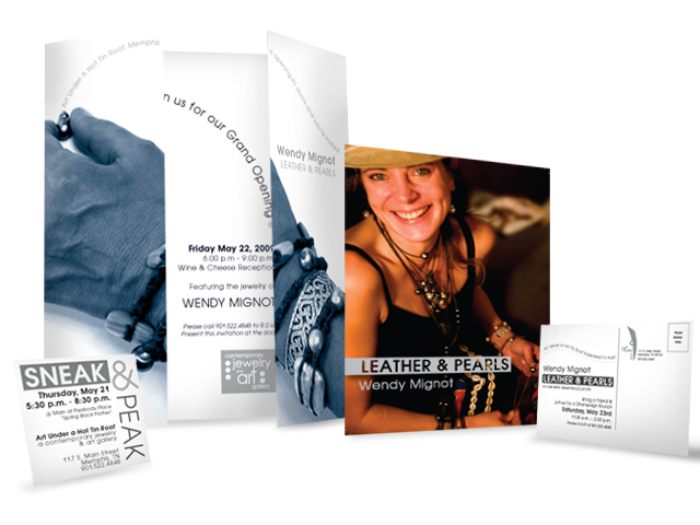
Art Under a Hot Tin Roof
Campaigns present different challenges than stand-alone pieces. For starters, each piece in a campaign, whether it be an ad, a…
Read more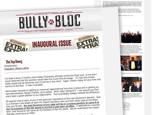
Bully Bloc E-Newsletter
I am no scientist. I am an artist. I like the way things look and beyond simple curiosity, I’m not…
Read more
Tennessee Industrial Printing – Ad Campaign
While working as art director of VIP City Magazines I had designed many ads for customers. Most assignments involved taking…
Read more