Taking on the task of developing an entire identity system for a company can be a daunting and difficult task. Nonetheless, it can be one of the most rewarding exercises in blending creativity with discipline. Most clients can’t afford to drag that process out over long periods of time. However, with a little patience, a strong identity can be built over a series of projects without bottlenecking the process in a design studio.
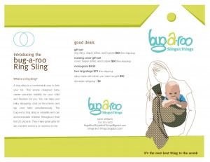
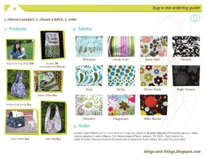
I’ve already posted about the evolution of the bug-a-roo logo project. Over the last week, that identity grew a little stronger. With a sales event pending, we needed some fresh marketing materials. We’ve always been on a tight budget so instead of spending a lot of money on die-cutting business cards, we’ve just cut a couple of corners off and punched some holes to give the impression of a sales tag. Well, that gets old fast so this was my opportunity to simplify. The solution ended up being implying that tag with shape. However, instead of the drawing the shape of a tag, I just drew the impression of a background. Using a darker shade of the main green pantone color, I added a sliver beneath to imply a shadow. I liked this so much that I carried it over to the brochure. 
The brochure was a redesign of something I threw together in about an hour for the last event. Since that was done around midnight, it looked uninteresting. I carried the green color and tag impression over to the brochure to see if I could still use it. It was starting to take shape so I stuck with it.
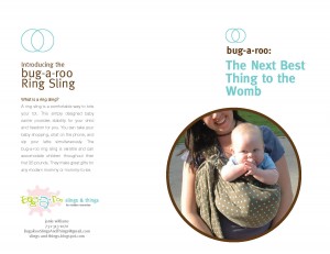
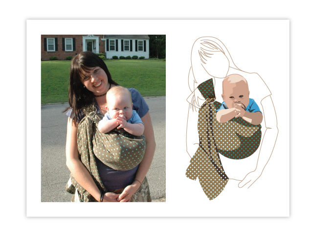
The previous design had a photograph of my wife holding our son in a baby sling. We didn’t have any more photos on hand so I decided to illustrate the old photo. If you are familiar with Adobe Illustrator, you know that you can click a button and, presto! you have an illustrated image of your photograph. That’s no fun, though. Besides, you get some funky-ness that doesn’t look quite right. If you do it by hand, not only do you get to brag about it, but any funky-ness is your own fault! This took HOURS. I had a blast, though. I worked with a skintone color palette, and created dimensional shapes and patterns to imply depth. It felt like the good ole days of paper and pencil.
This illustration technique had been on my mind quite a bit. I had wanted to do something similar for bug-a-roo for a long time but didn’t have the opportunity until now. We’ll see if it shows up again. Again, that is the beauty of taking your time to develop a visual identity.
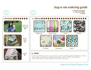
Well, I have to sign off because I have to be Mr. Mom so my wife can go sell these products. We’ll see how it goes. Check her blog out and order stuff from her: slings-and-things.blogspot.com.
