Overhauling an entire publication has been a long-time desire of mine. Although I have worked for nearly all of the VIP magazines over the last several years, I’ve not had the chance to reconsider each nook-and-cranny of the design. This November, I had that opportunity with VIP Memphis Magazine. Here are some of the changes and creative decisions that were made.
Logo Redesign


The original VIP Memphis Magazine logo consisted of “VIP” in Algerian and “Memphis” in Shelley Allegro. Shelley’s capital “M” didn’t suffice for the original logo so I remember using an “M” from another typeface and altering it quite a bit. This arrangement presented a number of problems. First, the script typeface would often be obscured due to the background of a given month’s cover image. Trees and foliage are common on the VIP covers as most of the covers were snapshots of couples attending local events. Secondly, there was quite a bit of height difference between the “VIP” and “Memphis.” This might not be such an issue in other logo designs but I always felt like it left a magazine cover feeling unbalanced. Finally, the “magazine” part of the logo was typed in Copperplate. That means there were three different fonts in such a simple logo. That’s too much.
These problems alone had not warranted a total logo redesign. However, over the last year, the magazine’s content had developed dramatically. The focus had shifted from an event-oriented publication to a culture and lifestyle format. The old logo needed a facelift that communicated that shift. This also gave us the chance to address the problems listed above.
The new solution eliminates the troublesome script type, evens the x-height, and by eliminating the superfluous “magazine,” simplifies the typeface choices. Although the “VIP” and “Memphis” come from two different font families, they are both sans serifs which keeps everything feeling consistent. Now the logo is a better match for our cover images.
Covers
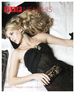
One of the key ingredients of a publication’s design is its cover. The logo design is essential to a magazine cover. However, the content of a cover is arguably the more important factor in whether it moves a magazine off the stands. VIP Memphis had improved its photography dramatically as it shifted focus from couples attending events to more conceptual content. Over the past year, that new focus has been refined. As fashion, culinary, and entertainment have become the new focus, the photographers have more direction and creative input than ever before. I can take little credit for the magazine’s cover redesign. That credit goes to Kat Semrau, publisher, and our photographers Jay Adkins, Regis Lawson, and Andrea Zucker.
Table of Contents
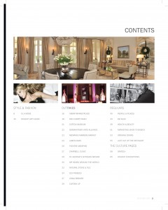
The table of contents is always the last element of a production (at least for me) but because it is the first designed page of a magazine, it sets the tone for what follows. This single page should exhibit a “design thesis” that informs (or reflects) the overall design. This means that it is clean and simple. Let the photography shine, keep information to a minimum, and leave the negative space alone. This sums up the design approach for the rest of the magazine.
The Grid
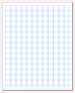
In recent years, I’ve discovered Josef Muller-Brockmann’s The Grid System. This ultimate design nerd book has convinced me of the advantages of using a grid system for publication design. First, a grid-design makes visual consistency easy. Secondly, it is a better alternative to straight template designs as more variation is possible. Finally, it saves a lot of time since you aren’t having to reinvent the wheel for every page. I don’t know what I did without it.
Features
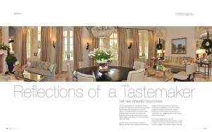
What I said about the cover is also true about the feature articles: the photography makes all the difference. One of the most difficult things for a designer to do is let someone else’s work receive the glory. It is a great temptation for a designer to put his/her creativity into a piece so as to take front and center stage. It is often thought that what a designer comes up with is what proves him as a designer. This isn’t always the case. I’m finding out that more often than not, it is more difficult to leave things alone rather than keep tweaking them. At any rate, the new features of VIP Memphis Magazines will feature great photography and minimal design. This means more time will be spent on size and composition than bells and whistles (like drop shadows and busy backgrounds). The type will also be simplistic and sparse.
Events
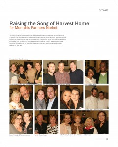
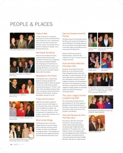
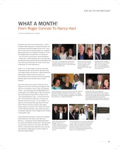
At one time, events were the heart and soul of any VIP magazine. Although they still hold an important role for the Memphis VIP, they are no longer a primary focus. Previously, events took a significant amount of time to design. You had to utilize all available space, squeeze as many photos in as possible, compose each photo to fit, and add a little spice to “dress it up.” The redesign took into consideration all of these things. First, there wasn’t as much pressure to jazz each event up because that would take focus away from the features. Secondly, because of the grid system, a lot of decision time has been eliminated. Thirdly, we no longer have to utilize every square inch of negative space as we are letting the page “breathe” a bit. Finally, also due to the grid system, each event is flexible; I can change it from a half-page, horizontal to a half-page, vertical in no time.
Articles & Regulars
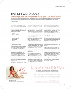
The more busy a page is, the less interesting it becomes. As readers flip through the pages of a magazine, they stop on pages with big, beautiful photos. As they continue through pages of ads, a sparse page with limited text will catch their eye. The articles in VIP Memphis (real estate, business, film, beauty, etc.) are uniform and occupy nice, big white pages. A bold and clear headline communicates the content. The paragraphs are spaced out rather than indented. Each line is spaced a little further than usual so as not to appear so dense. To top it off, the body text is pulled in further from the edge of the page than the headlines. This opens a lot of space and doesn’t daunt the reader. A reader is more apt to read an article if he knows it won’t take him too long. Generally, great efforts were taken to clean up the articles by simplifying the design rather than overwhelm the reader with more graphics.
That’s a lot, I know, but as I said, I’ve wanted to do this for a long time and had a lot of fun working through it all. There is still much work to be done. Because publication design and production is constantly evolving, I’m excited to keep refining this product. As problems arise, so do solutions. I’m sure I’ll be posting more on it in the future.

Thanks for the comment, Jackie. I won’t approve it so your number doesn’t show up on my blog. I’ll call tomorrow to discuss the project. I’m looking forward to it.