Casey Jones was a heroic train conductor who sacrificed his own life to save all of the passengers on his speeding train when it collided with a stalled freight train in 1900. Jones was originally from Jackson, Tennessee, so it would be fitting for a tourist attraction to be established in his name. Casey Jones Village and BWCreative began a working relationship in late April of 2009. One of the many projects commissioned was a logo for the Casey Jones Historical Fund.
This fund was established in partnership with the West Tennessee Healthcare Foundation to benefit the new Casey Jones Railroad Museum. The logo needed to stand alone, apart from the various enterprises under the banner of the Casey Jones Village. Originally, I wanted to try my hand at a horizontal, rectangular wood-cut image of a train. However, after we discussed the project, the client had envisioned a circular design resembling the front of a steam engine. Open sketchbook.
Since late April, I’ve been pouring over train books noting details in train design as well as turn-of-the-century promotional design (I LOVE the public library!). I am still in the process of forcing this obsession on myself; I think this is only the beginning. Any-hoo, one thing I’ve noticed about this period in design is the typefaces. These faces range from the very stout sans-serif to the elegant, scripty style such as I used in this logo. I particularly love the embellished jut from the lower portion of the ‘J.’ I decided to use the initials in this decorative way because I didn’t like the alternatives I kept coming up with. Any image would be a departure from our train-face; a number, as is common in such spots on trains, would confuse the message of the logo. I saw this as an opportunity to develop an identity that is strongly rooted in the period style rather than a literal depiction of what the fund was established to do.
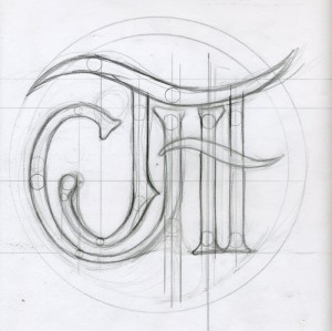
The sketch you see below was a rough idea of what I wanted to do. In the beginning, I tried tracing this sketch but you can never underestimate the subtleties of a well crafted typeface. I ended up using Harrington as my base and altered the design to achieve the solution you see here. And there’s the key word: solution. Much of design is problem-solving. Sometimes the problem is simple and it doesn’t take much to solve it; sometimes the problem is great and takes a lot of time to solve. Unfortunately, some logo projects, if executed well, will seem like it took ten minutes to accomplish. I’ve grown fond of telling clients that logos are “deceptively simple.” What seems like an obvious and quick solution may have taken hours to accomplish.
The end result here was completed by our deadline and the client was pleased. I love having a fresh start to an enterprise. Unlike other projects commissioned by Casey Jones Village, I get to be involved in the Historical Fund’s identity from the beginning. Stay tuned to see the development of the Casey Jones Village, the Old Country Store, the Casey Jones Home and Railroad Museum, and the Casey Jones Historical Fund projects. I’ve had a blast working with them and can’t wait to show you more.


[…] ceremony program, information form, and a logo. Since I’ve already blogged about the logo, I’ll just summarize the other […]