Client Overview
Los Portales is a family-owned Mexican food restaurant with over 11 locations throughout West Tennessee. Known for excellent food, fast service, and great value, Los Portales has become a local fixture wherever one is found. After over six years without changing menus or prices, management began planning on rebranding the enterprise.
Project Description
As management began preparing a complete menu overhaul it became apparent that though similarities in identity may have occurred across multiple locations, consistency was accidental at best. The pending menu project, also designed by BWCreative, would be the ideal opportunity to launch a new brand.
The only direction offered by the client was an explanation of the name: portales. A portales is an architectural feature or structure designed for open-air seating or dining. Portales are commonly supported by archways. The name evokes warmth, leisure, and exotic escape. The restaurant staff reflects the name and the logo design would have to as well. The Los Portales experience is not formal, but rather fast and friendly. We began by exploring letterforms and compositions that implied motion, speed, informality, and invitation. We wanted to welcome regulars and invite newcomers all in a single design. Below is a demonstration of the design process broken into sketches, ink comps, vector comps, and the final design.
1. Sketches
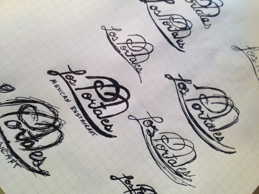
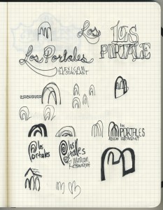
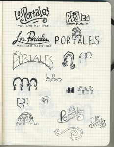
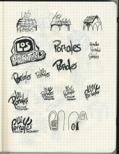
Pages and pages of graph paper were filled with ideas and variations of ideas. The point was to visually brainstorm over as many pages as possible within a week’s time. Everything from script letterforms to literal portales illustrations were explored. Motion was visually represented by small, quick thumbnails. After a while, it became apparent that archways had be incorporated into some of the ideas before pitching concepts to the client.
2. Ink Comps
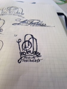
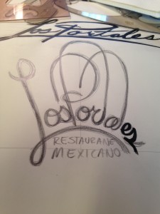
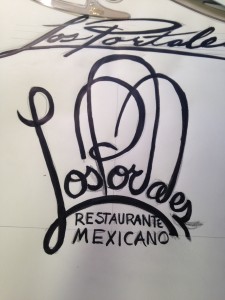
As is usually the case, a few key concepts began resurfacing multiple times during the sketching process. Four or five of these concepts were selected for further development as ink comps. The sketch was drawn on a larger scale in pencil, which forced solving visual problems such as proportions of lowercase and uppercase letterforms, the balance of composition, and stroke weight. After a few attempts at solving these problems in graphite for each concept, the strongest solutions were inked using black india ink and brush. This further informed stroke weight and angle while achieving a rough comp ready to present to the client.
3. Vector Comps
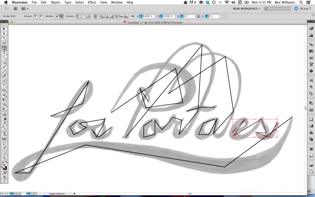
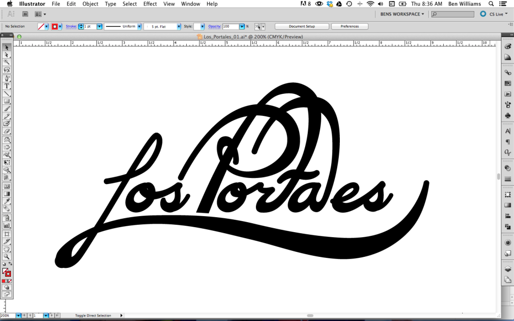
The client favored a concept that wove three arches from the letterforms in the word Portales. The selected comp was scanned and imported into Adobe Illustrator.
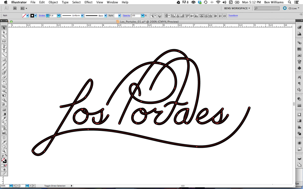
Key points were identified in each of the letterforms to create a rough angular stroke of the design.
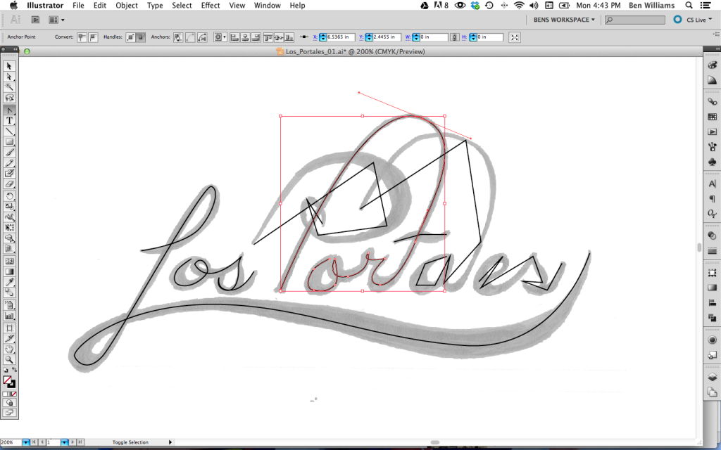
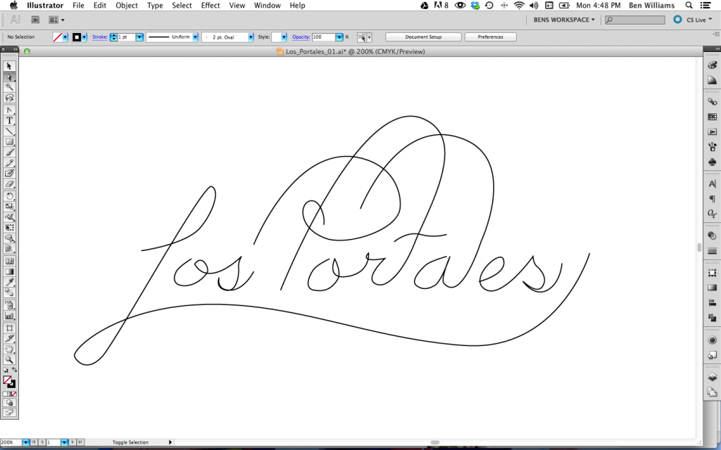
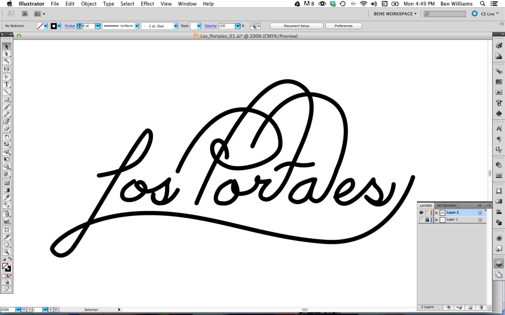
Next, the points were appropriately rounded to create a single smooth stroke, which served as the skeleton.
This skeleton was then thickened to determine the smallest stroke weight once flares began to develop.
Simultaneously, rough curves were smoothed and spacing was tweaked.
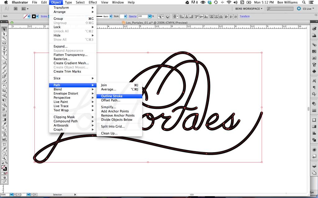
Once the basic skeleton was complete, the stroke was converted to outlines to begin to add dimension to the design.
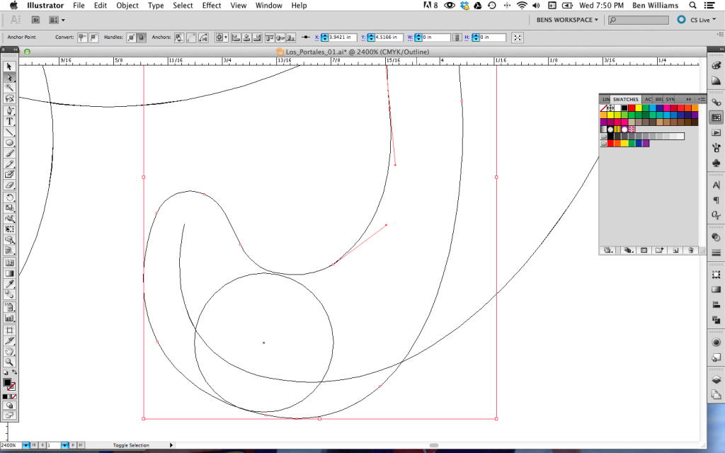
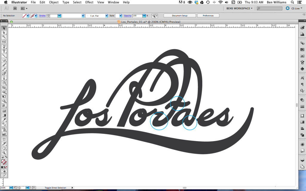
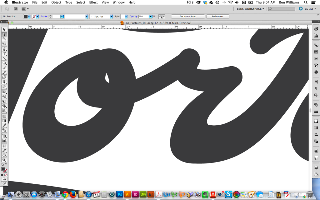
Using a predetermined stoke weight for the thicker parts of the flares, represented by a vector circle, strokes were thickened in strategic locations. Using Illustrators outline viewing mode enabled easy edge location while allowing the circle to inform the width of the flares.
Once this was completed, problem areas in the design could be identified.
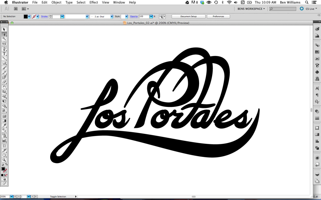
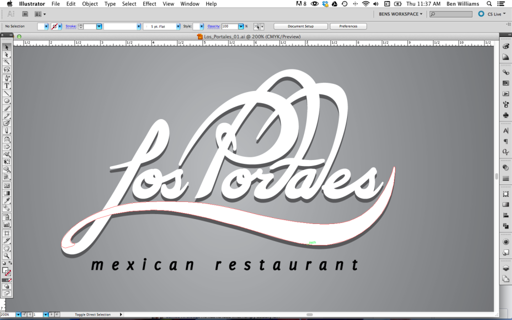
The stroke thickness of the tails of ‘r’ and ‘a’ were too drastic and needed some tweaking. The drastic descending foot of the ‘L’ was tweaked to complete the main design process. Some shading and shadows were applied to begin testing the main design in a generic context. Finally, exploring typefaces for ‘mexican restaurant’ rounded out the vector comp.
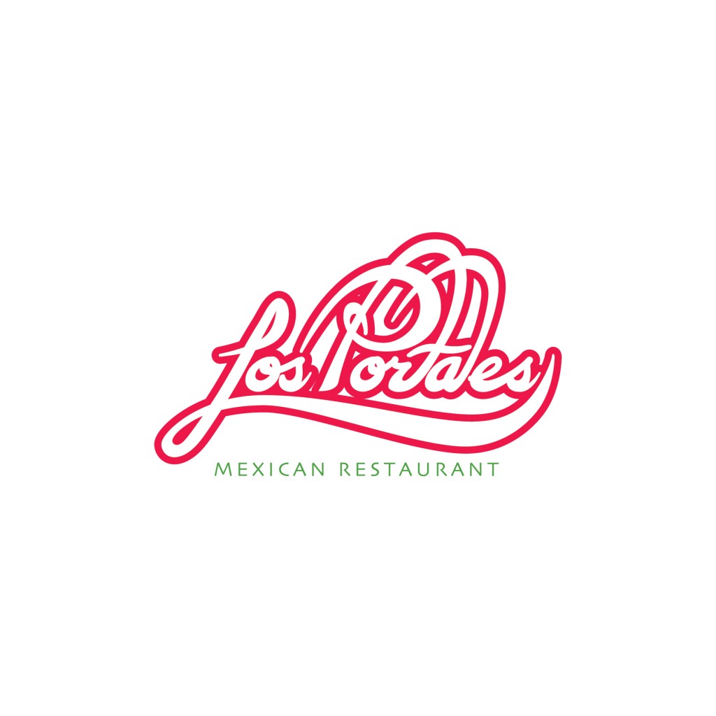
Traditional Mexican color combonations were applied to the logo (red and green). Because the menu project coincided with this project, color selection developed in formatting there and later applied to the logo.
The drastic descending foot of the ‘L’ was tweaked to complete the main design process. Some shading and shadows were applied to begin testing the main design in a generic context. Finally, exploring typefaces for ‘mexican restaurant’ rounded out the vector comp.
Traditional Mexican color combonations were applied to the logo (red and green). Because the menu project coincided with this project, color selection developed in formatting there and later applied to the logo below.