I love to promote things. I’ve been known to go to the trouble of creating a marketing campaign for a neighborhood block party. One great thing about promoting events or programs is that, generally speaking, they are short lived. There is a freedom in designing such applications that does not exist in, say, a branding project.
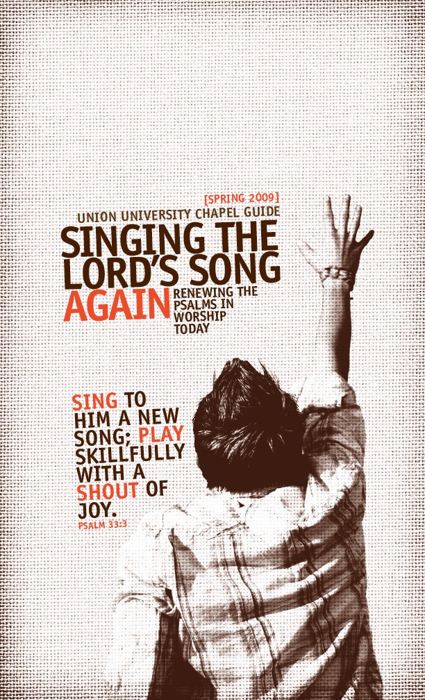
 In the case of this project for Union University, there was a definite theme for their spring, 2009 semester chapel program. All speakers were to relate the ancient use of the psalter to modern Christian worship. As a designer, there are some obvious visual roads to travel down on a project like this. The ancient/modern tension is a fertile ground for any designer. However, the most common approach, especially in terms of design for religious organizations, is to incorporate images of old paper, books, or anything recalling an old monastery in Europe. There is nothing wrong with that approach (I’ve used it many times). For this project, though, I wanted to go another route. It is sometimes good to consider the most obvious stereotypes at the beginning so you know what not to do (I’d love to design a coffee shop logo that did not incorporate a steaming cup of coffee into the design). Instead, I asked the question, “how can I design something in a contemporary style without trying to make the old look cool?” This presents a number of problems such as imagery, font selection, color selection, etc. For example, if I’m going with an ancient feel, I’m not likely to use a bright color such as orange; I’d choose a couple of drab colors.
I found myself thinking about old 1970s office buildings with baked coffee in a percolator, scratchy office chairs, and a musty secretary smoking a Camel cigarette and wearing chic horn-rimmed glasses. As I looked through textures for a background, I imagined the upholstered cubical walls in this office. I found the perfect background image. I wanted to update my 70s vibe a little so I used Officina Sans (an appropriate name, I think) for the font. Being a two-color project, I searched for an ugly brown to be my base color. After experimenting with a number of brighter colors for my accent color, I settled on that bright orange. This scheme makes me think a little about the mystery candies you’d get at halloween after trick-or-treating (what were those things). I knew, though, that I’d have to find a central image to pull everything together. Back to my “obvious stereotype” brainstorming.
Go to any Christian bookstore/web site that sells CDs and you’ll find the “Praise and Worship” section. I’d bet you’d find a large percentage of package designs will incorporate some cool college student with spikey hair lifting one or both hands into the sky. This, of course, is the obvious stereotype. I used this stereotype. I found my spikey haired kid with a nice ugly flannel shirt I thought would look good on my brown textured background. Shameless!
Sometimes design begins with ideals but it is amazing how quickly that can change before a project is completed. This is one thing I love about design. Again, it is the disposable aspect that makes the creative part so free and fun. Sure, we’re free to have ideals, but we’re also free to fall back on reliable solutions. Hopefully, the result is a good looking promotional item that lasts 3-6 months in the back of some college student-with-spikey-hair’s notebook. It communicates something to generate interest pertinent to the day, provides practical information, and retires to Florida somehow.
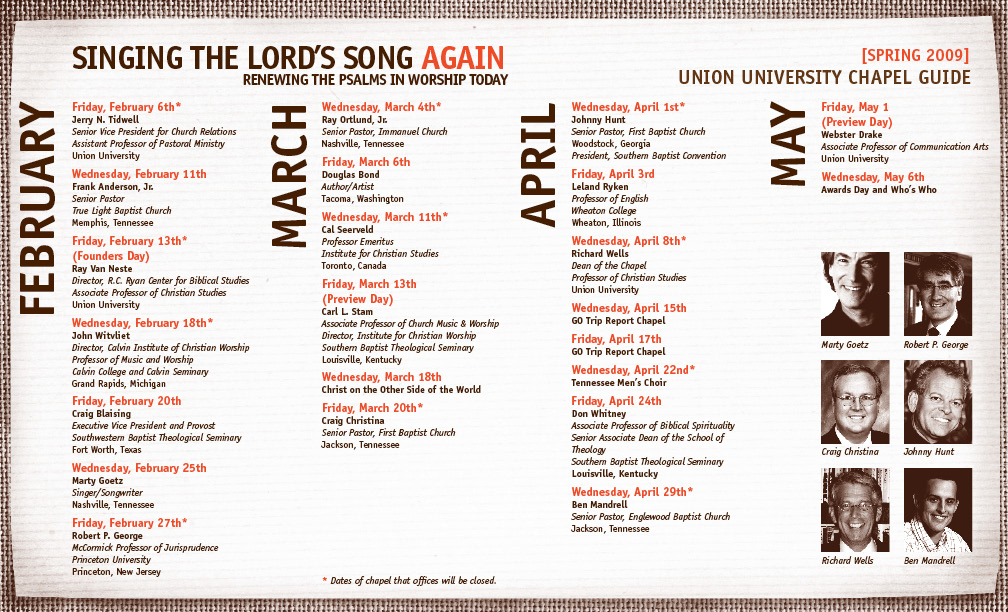
Anyway, I’m very pleased with how this project turned out. My favorite part is the type setting and organization of the calendar. I know I’m a nerd but that stuff just makes my day. Everything is nice and neat. I love it.

