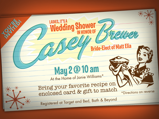
Casey Brewer: Wedding Shower Invite
I’ve been designing a lot of invitations lately. The nice thing about designing invitations for events such as wedding showers…
Read more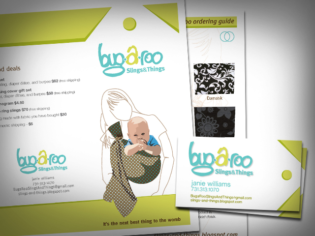
bug-a-roo: Identity Development
Taking on the task of developing an entire identity system for a company can be a daunting and difficult task….
Read more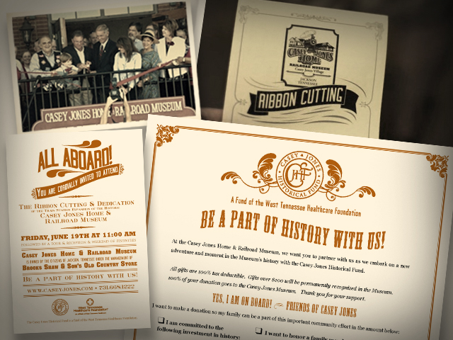
Casey Jones Village: Museum Ribbon Cutting
One of the first projects I did for Casey Jones Village was a promotional campaign for the grand opening of…
Read more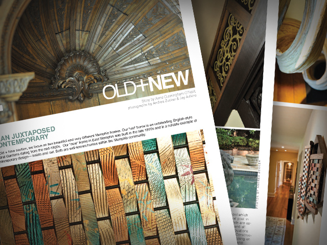
VIP Memphis Magazine: Old+New Feature
The role of a designer is distinct from any other artist. Designers take elements from other disciplines (photos, type, drawings,…
Read more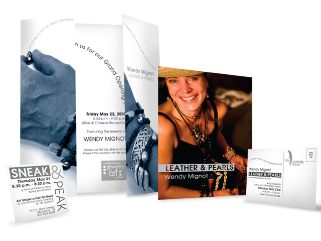
Art Under a Hot Tin Roof
Campaigns present different challenges than stand-alone pieces. For starters, each piece in a campaign, whether it be an ad, a…
Read more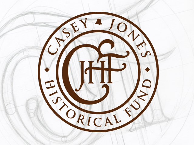
Casey Jones Historical Fund: Logo
Casey Jones was a heroic train conductor who sacrificed his own life to save all of the passengers on his…
Read more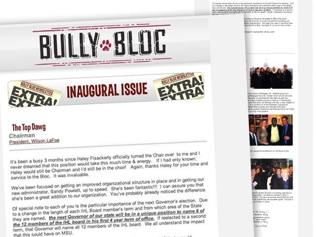
Bully Bloc E-Newsletter
I am no scientist. I am an artist. I like the way things look and beyond simple curiosity, I’m not…
Read moreIndigenous Outreach International – Logo
I don’t know if it could be any worse. A logo made up of clip art and Papyrus! Indigenous Outreach…
Read more
Bug-a-roo: Logo
It began as bug-a-BOO but that name was already taken. The product was a ring sling that moms could carry…
Read more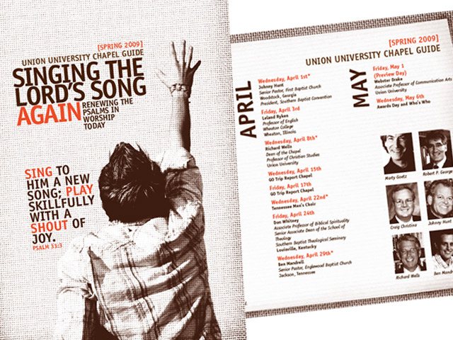
Union University – Chapel Guide [Spring 2009]
I love to promote things. I’ve been known to go to the trouble of creating a marketing campaign for a…
Read more